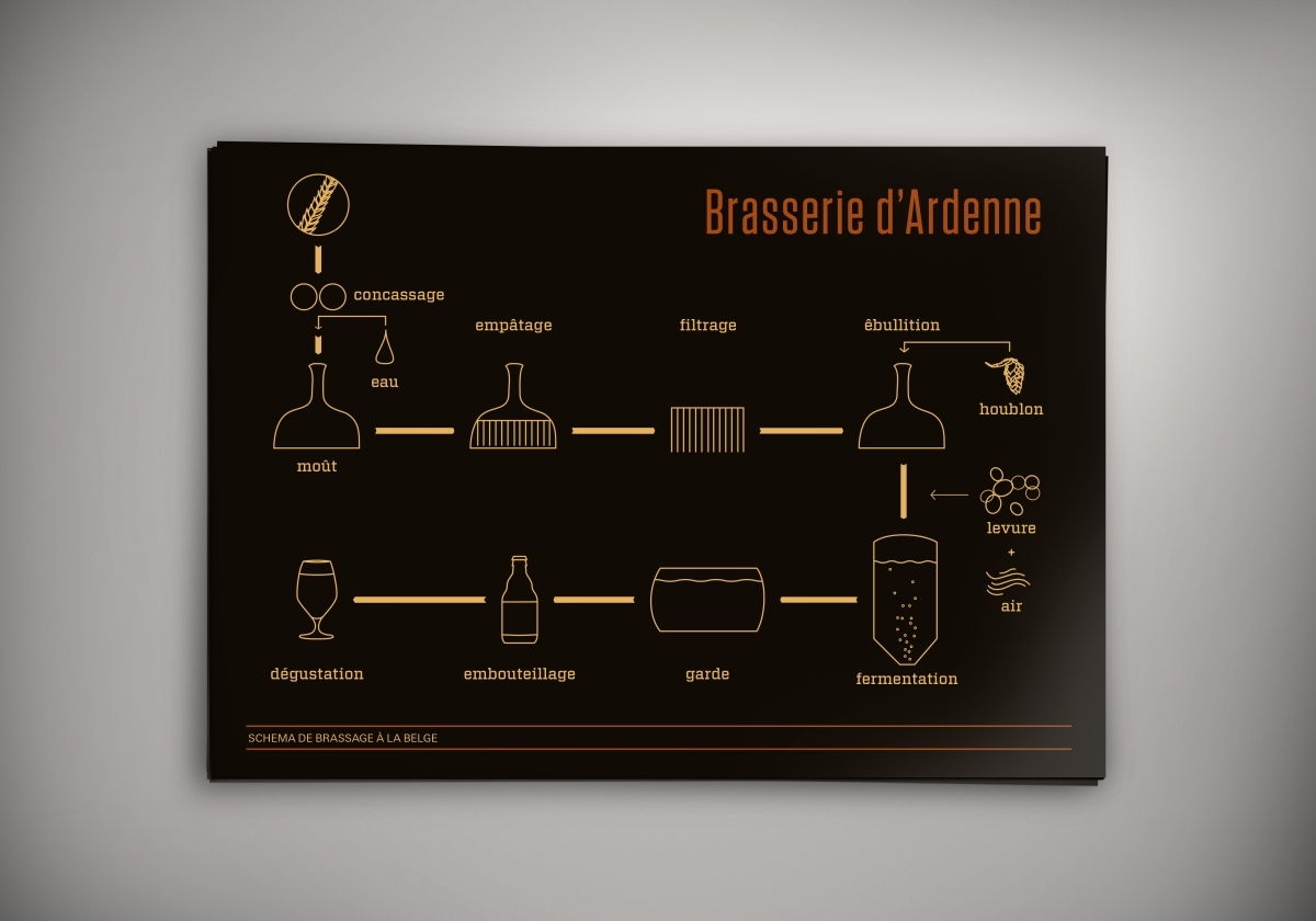
Développement d’une nouvelle bière.
Identité & communication visuelle.

Årdene is Walloon for Ardenne as the that is where the brewhouse is based:
» The word comes from the Celte, Ar’Den, that signifies the darkness to describe the forest of the Ardenne. »


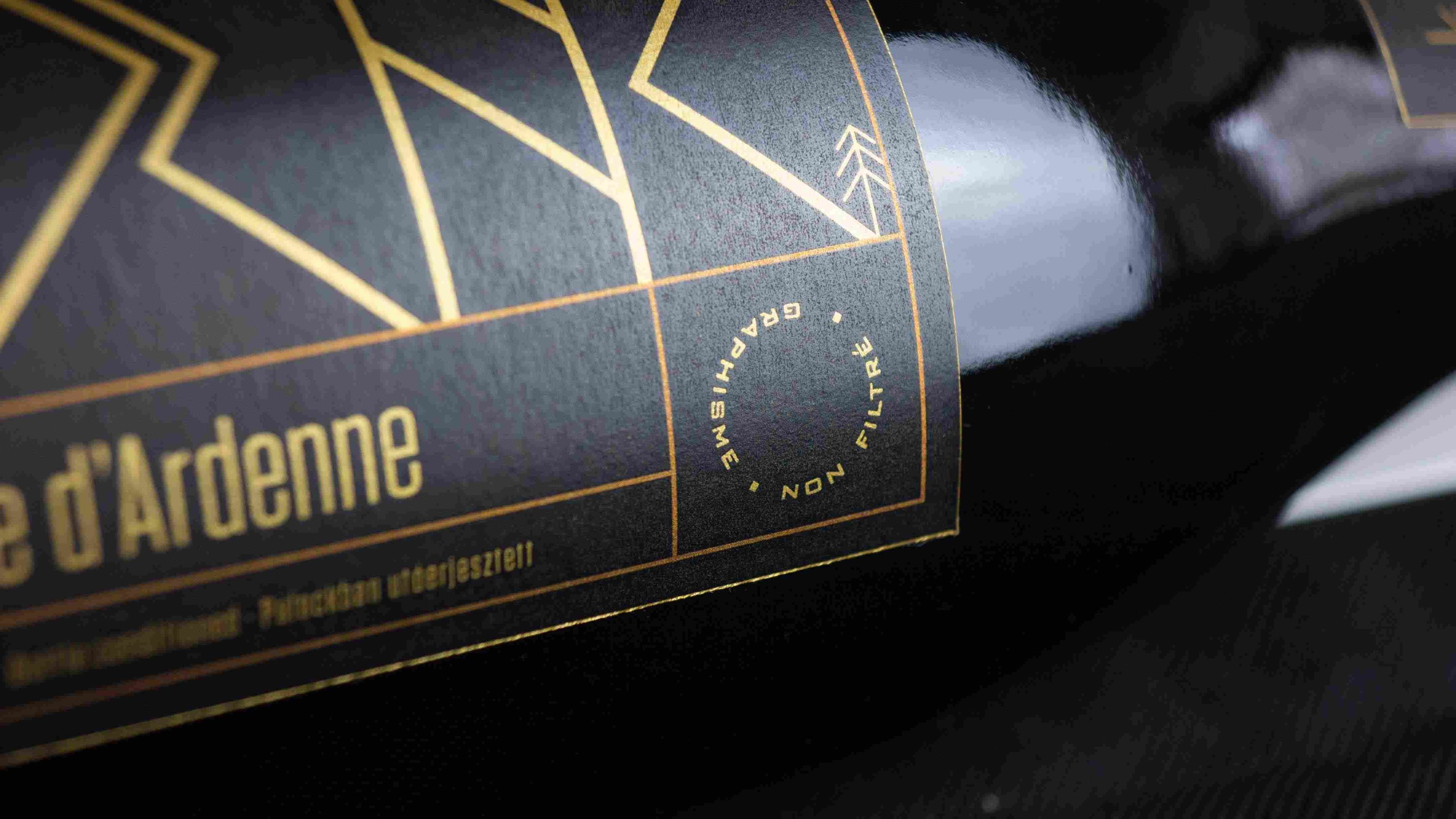
The choice of paper is defined by the type of beer. The idea of the inverse design is based on the production of brewing, that is the primary materials will always outshine the end result, therefore having an effect on the taste of the final product. Just as in as in graphic design, here the usage of a paper of high quality.
That sense, it is essential to use the best materials available both in graphic design and in brewing.

The logo —Årdene— doesn’t show at once. By turning the bottle the logo reveals itself just as a landscape of the Ardenne. The pine tree motives are there reinforce this intention.
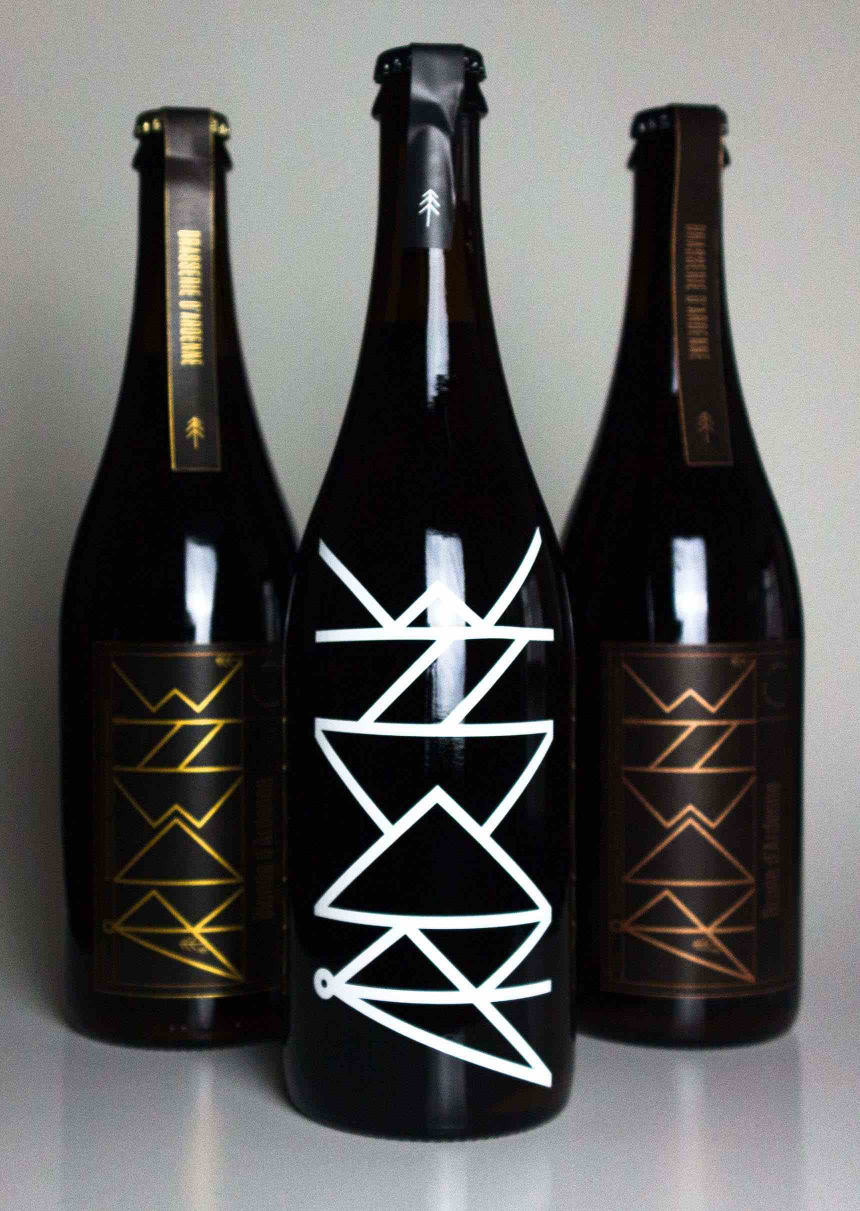


On the special edition, only the logo is present. This showing the clear material of the bottle is a reference to the production of this particular beer. Such as the transparency of the design is reflecting the « transparency » in the production. It means only the best available materials are used at all times. The beer itself is the main focus, it is not hidden by the design but coexists with it.
Seasonal types
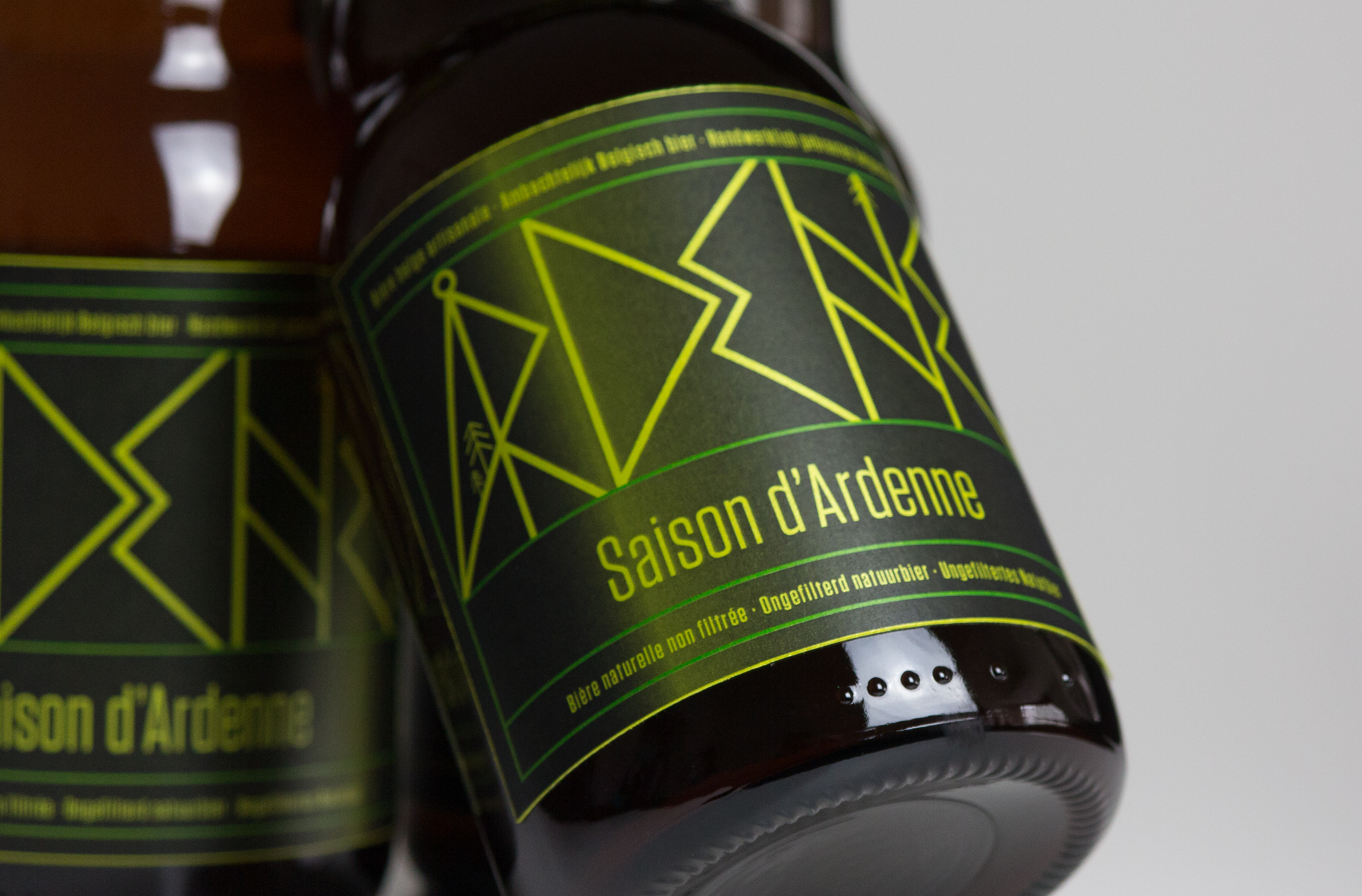


The gradient on the labels represents the movement of the sun. There are three different versions.
Additional products